Bookish Diversions: A Cover to Judge By
New Tom Wolfe Covers, ‘Outerwear for Books,’ Art Meets Advertising, Janet Hansen’s Process, the Mysterious Janet Halverson, More
¶ Wolfe in chic clothing. New journalism provocateur and novelist Tom Wolfe, according to David Brooks, “pulled off an astounding trick, turning sociology into art.” The trick still works, as evidenced by his posthumous books sales; Wolfe died in 2018 but remains relevant today. Still, as we know, publishers must keep the trick going by ongoing investment—including reissuing beloved old books with attractive new covers.
To that end, Picador plans on releasing thirteen Wolfe titles over the next many months in fresh-but-retro clothing, all by acclaimed illustrator and designer Seymour Chwast. Here’s a look at several of Chwast’s new designs.
¶ “Outerwear for books.” I had only marginal contact with the world of book packaging before working at Thomas Nelson, where interacting with designers became a regular part of my job as an editor and later publisher. Nelson had several fabulous in-house designers and worked with some very talented freelancers; one whose covers I appreciated was Chris Tobias. I left Nelson over a decade ago, but Tobias is still going strong. He’s got the best tagline in cover design: “Outerwear for books.”
That is, of course, what a book cover is: the external representation of what is otherwise an opaque and impenetrable block of ink, paper, and glue—or just a thumbnail on a screen meant to say whatever can’t be expressed by a few meager lines of description copy. Never judge a book by its cover? That’s the whole point!
Janet Hansen gets that.
¶ The best kind of advertising. Hansen serves as an art director at Alfred A. Knopf and Everyman’s Library. She’s also worked for Farrar, Straus, and Giroux, New Directions, and others. “It’s . . . important to remember,” she says,
that while writing is an art form, ultimately a book is a product and its cover is an advertisement. My job is to find a balance between capturing the essence of the book while also making it “commercial” enough to entice retailers into marketing it and readers into buying it. . . . A good cover is a signifier that the process of putting this book out in the world has been thoughtful. It lets you know that the people putting it together care about it. And if a cover is good, people are more likely to share it on their social media. There’s so many more outlets for advertising in that way.
While the product-ness of a book can and probably should remain invisible to readers, publishers will go out of business if they neglect the fact.
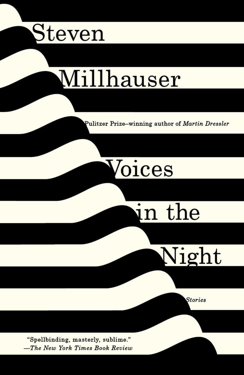
Nor should we assume the commercial focus undermines the art itself. The online marketplace Artsy has highlighted Hansen’s work as particularly effective. One jacket Hansen says she’s especially proud of? Steven Millhauser’s Voices in the Night. You can find it and many more at her website.
¶ New editions, new art. The product-ness of books encourages new levels of creativity as opportunities present themselves. We can see that in Picador’s Wolfe repacks with Chwast. The transition from hardcover to paperback also presents an opportunity for refreshing covers. Late last year the New York Times compared eight hardcover-to-paperback redesigns with a bonus: conversations with the designers about the various considerations behind the changes.
¶ How are covers designed? Typically, everything starts with a design brief of some sort created by the publisher or editorial team, to which they usually attach the book proposal and the manuscript, or at least parts of it if the book is still incomplete. A brief may reference themes and ideas, colors and styles, and comparable covers.
The job of the designer is to take those inputs and draw out the theme, message, or vibe of the book so it can be given visual representation. To get started, Hansen tries to read the manuscript or at least parts of it before laying out ideas.
Reading the manuscript is step one for me. If I don’t have the time, I at least read several chapters. I highlight recurring themes or any visuals that I think could represent the book well, then create a grid of these themes and try to think of ways to visually represent them all. I usually will narrow my ideas down to three different concepts, and then focus solely on those. . . . While I think of visuals that capture the essence of the book, it also needs to work well with its title. I try to steer clear of imagery that is used often on covers, and instead go with something that is visually interesting to me personally.
She says she often finds inspiration in film and fine art.
¶ Yes, but does it pop? The designer will then usually present a handful of possible designs comps to the publisher. These comps can multiply depending on how invested (or meddlesome) the publisher is and how well they think the designer gets the book. Words that fill every designer with murderous intent? When the publisher looks disappointedly at a comp, head angled sideways with either their mouth, brow, or both scrunched up, and finally says, “It doesn’t pop. It needs to pop.”
Usually the team will go through several rounds of changes before the author even sees the cover. And the number of rounds can easily swell in proportion to the expected size of the book’s sales—there’s more on the line.
The design brief for
’s eventual bestseller Yellowface said it needed to resemble a “big book.” “That’s a classic phrase, which basically means, ‘can it look like nothing else, but also, everything else?’” says HarperCollins Publishers deputy art director Ellie Game. She and her team ended up producing some seventy-five separate comps before landing on the design that graces the cover today.I think you’ll agree it pops.
¶ Different markets, different visions. If you purchased Kuang’s book in the US you might notice a slight difference between it and the UK cover above—her name. In the US, Kuang goes by her initials R.F. But differences on covers can be far more pronounced than names and initials.
Different markets, such as the US and UK, can mean radically different visions for the very same book. I sometimes buy from the UK publisher if I prefer the cover but have occasionally bought copies of both editions. It’s fun to view the covers side by side. See, for instance, Adam Smyth’s The Book Makers, which differs slightly in title and subtitle and dramatically in design between the two editions.

¶ Timing and deadlines. With all the back and forth on cover designs, it can take a long time to finalize a jacket. ”The cover design process can take just a handful of weeks or months depending on the design direction and speed of team feedback and deliverables,” says designer Monique Sterling. But this is where the product-ness of the book rears its head again.
Book covers are usually—fingers crossed—finished in time for sales conference, which is roughly nine months, give or take, before publication. The sales team needs covers, catalog copy, and galleys if they can get them to help convince retailers to stock the books on that season’s list.
In the weeks before sales conference, you can find designers working in a flurry, like squirrels getting ready for winter. I’ve seen books go from concept to final design in less than a week. Then again, sometimes books end up with placeholder covers that go out to Amazon and other online retailers only to get swapped out for something final (and hopefully better) closer to publication.
¶ A clever cover for 1984. Despite the sometimes crazy, harried schedules, real art and creativity are surprisingly normal in publishing. Gobs of smart, charming, compelling, and aesthetically rich designs come down the conveyor belt every season. Some are shockingly clever, such as the censored cover of Orwell’s 1984. The type is debossed so you can read it when the cover is angled against the light, and—this is where the real genius comes in—the more you handle the book the more the censored bits fade and reveal title and author.
Some designer not only thought of that, they worked with the production team to figure out how to do it! Amazing.
¶ Being for the benefit of Mr. Mansfield.The coolest thing I ever managed like that was when I published Ken Mansfield’s memoir from his years working with the Beatles. The package for The White Book was a direct play off the Beatles’ so-called White Album with a blind embossed title. We even figured out how to stamp a unique serial number on every book, same as the record.

¶ The value of paper. Given their role in marketing books, it should come as no surprise that book jackets have a fascinating history. And sometimes that history has a direct bearing on the value of the book. A first edition of F. Scott Fitzgerald’s The Great Gatsby with the cover is worth considerably more than without. “The average price for a 1925 first edition in good condition without the dust jacket is at around £5,000-£7,000,” according to one site, “whereas with the dust jacket the book is worth over £120,000.” That’s almost 2,000 percent more for a simple sheet of folded paper!
¶ The mysterious Janet Halverson. From the 1950s to the 1990s, designer Janet Halverson created one beautiful and compelling cover after another. And then she, “a female pioneer of modern cover design,” as Steven Heller refers to her, basically disappeared.
Halverson served as art director at Harcourt Brace Jovanovich and worked on major books throughout her career, books by Maya Angelou, Joan Didion, Walker Percy, John McPhee, and—almost bringing us full circle—Tom Wolfe, plus countless others.

“She was trusted to do really important books,” says enthusiast Michael Russem. But despite being a leading designer of her generation, she’s mostly forgotten today. “There’s nothing about her anywhere,” says Russem. “Graphic designers . . . all recognize her work and recognize it as being good. But she just went unnoticed, which is true of all the women of her generation.”
Michael Russem did his part to remedy the crime by hosting a recent exhibit of Halverson’s work. Here you can read Russem’s perceptive analysis of one of Halverson’s designs. Remarkably, press about the exhibit turned up Halverson’s niece who helped fill in some details about her life, including the amusing revelation that Halverson hated her cover for Colleen McCullough’s phenomenal bestseller, The Thorn Birds.
The People’s Graphic Design Archive keeps a collection of Halverson’s designs that repays any time spent with it. Unfortunately, it’s nowhere close to exhaustive. “Halverson designed, art directed or illustrated over 1000 book wrappers,” says Heller.
Halverson worked well with other designers and illustrators. “I loved Janet,” said one illustrator when asked about her. “She was great to work with.” Bringing us completely full circle, that illustrator was none other than Seymour Chwast, whose delightful new covers now adorn Tom Wolfe’s back catalogue.
Thanks for reading! If you enjoyed this post, please hit the ❤️ below and share it with your friends.
Not a subscriber? Take a moment and sign up. It’s free for now, and I’ll send you my top-fifteen quotes about books and reading. Thanks again!
Before you go, check out…


The difference between the US and UK book cover design of The Book Makers is interesting. I prefer the UK design, but the hyphen in the US Book-Makers that explains an autocorrect phenomenon that really annoys me. I will type a two word phrase and spell check/autocorrect will suggest a hyphen between the two words, even though I have never seen a hyphen between them before. Canadian spelling and punctuation is closer to UK than US, but because we buy technology in North America spell check/autocorrect functions are often US by default.
I love a good cover design, but lately I've been chosing good inside book formatting over cover design. I got a few modern paperback editions of books I liked that had very nice cover designs, only to discover the faint printing and thin paper, thin enough for the printing to show through on the other side of the paper, rendered the edition too difficult to read.
Love this post! We're big Harry Potter fans, and the UK covers were so cool, and different, from the US. I've had some firsthand experience with covers as a children's book author. The first (Her Own Two Feet) looked totally different than I imagined it would, but the design team at Scholastic knew what they were doing and I love talking to kids about the choices they made, from the colors (mirroring those of the Rwandan flag) to the photo of my Rwandan coauthor (it says so much about who she is and the kind of story we're telling). Book two, middle grade fiction, was a totally different experience. I had an illustrator, the talented Billy Yong, who did both interior and cover art for The Minor Miracle, working with the design team at Waterbrook. It's a fascinating process. Thanks for pulling back the curtain here.