Books Before Print, Paper, and Pixel
The Art and Function of Medieval Manuscripts: Reviewing ‘The Lindisfarne Gospels,’ ‘Imperial Splendor,’ and ‘Performing the Gospels in Byzantium’
In our day books are mass-produced objects. An author sends her manuscript to the publisher who edits, designs, and typesets the text so it can be printed, bound, and sent to stores or published as an ebook. That same text might also be recorded for audio distribution. Thousands of readers will experience the exact same book with only minor differences stemming from their choice of format.
The only word in the prior paragraph that would have made much sense before print and digital production, however, was manuscript. Back then every book was hand written. As a result, each book was a one-off. No two were exactly alike; each reflected the individual artistry of the scribe and illuminator who produced it.
That goes all the way down to the materials of production. Before paper came to Europe, books were written on parchment prepared from the hides of cows, sheep, and goats. Inks and decorative pigments were processed from oak galls, iron salts, red lead, indigo, lapis lazuli, verdigris, and other materials including gold leaf. All these various inputs produced highly variable outputs, many of which still stand out for their singular and remarkable beauty.
The Lindisfarne Gospels

The sumptuously decorated Lindisfarne Gospels were produced in the eighth century at the Lindisfarne monastery off the northeast coast of England. Christianity had only come to the area a few generations before through the missionary work of people like St. Aidan who founded the monastery in 635.
With influences from Ireland, England, and Rome, St. Eadfrith, the bishop of Lindisfarne, began composing the book toward the end of his life. He finished just years, maybe months before his passing in 721. In The Lindisfarne Gospels: Art, History, and Inspiration, Eleanor Jackson, a curator of illuminated manuscripts at the British Library, offers a survey of the book’s unique history and composition.
The Lindisfarne Gospels present a Latin Vulgate text of the Gospels of Matthew, Mark, Luke, and John, along with two prefaces by St. Jerome, translator of the Vulgate, on 518 pages of calfskin parchment, measuring about 10 x 13½ inches. At that size, such a pagecount required the skins of about 150 animals.
One reason for the high pagecount, as Jackson explains, was displaying the words per cola et commata “in which each clause or phrase began on a new line, a practice that was reserved for only the costliest biblical books owing to its extravagant use of parchment.” It took up a lot of space. Copyists used per cola et commata to facilitate easy reading, especially in liturgical settings; books like the Lindisfarne Gospels weren’t for individual reading so much as public pronouncement.
The Lindisfarne Gospels also feature an Insular innovation for improved reading and comprehension: spaces between words. Medieval manuscripts followed the ancient Greek and Latin practice of running allthewordstogetherlikethis. (For that matter, they rarely used punctuation.) Irish and Anglo-Saxon monks began deviating from this practice around the eighth century and breaking up what one scholar dubbed the “river of letters.”1 Despite the benefits of the new approach, it took centuries for the innovation to take hold across Europe.
More extravagant than the use of parchment were the visuals. Small decorative touches fill the volume, accompanied by thirty-one, stunning, full-page illuminations. The Gospels features icons of the four evangelists, patterned on classical portraiture, along with their associated symbols:
     Man: Matthew
     Lion: Mark
     Bullock: Luke
     Eagle: John
Supplementing these portraits, there are intricately decorated “carpet pages,” which utilize an elaborate mix of geometrical shapes and interweaving bodies of birds and beasts. The illuminator plays with pattern, color, symmetry, and asymmetry to create mesmerizing designs.
Heavily designed incipit pages follow the carpet pages. The opening words of each gospel, highly stylized, fill the entire space. “The decorative treatment of letters is developed to the point where they become an image,” writes Jackson.
The opening words are written in display script, progressively decreasing in size as they go further down the page. . . . With their apparent ability to metamorphose, expand, contract, progress and interact, the letters seem to be living beings, reminiscent of the interlaced and contorted creatures that are so prominent in the decoration. More than just signifying the sounds in the words, these letters seem to embody the richness of meaning and spiritual vitality which might be found within scripture.

To serve both decorative and critical functions, Eadfrith also included full canon tables. These lists, pioneered by Eusebius of Caesarea in the fourth century, chart correspondences between each of the four gospels so readers could see where stories run parallel, one book to the next.2
Perhaps the most remarkable feature of the Lindisfarne Gospels is its continued existence. This singular book survived Viking raids, multiple transfers, the dissolution of the monasteries, at least one conflagration, and the greatest enemy of books the world over: time.
Book Culture in the Holy Roman Empire

Whereas Jackson’s excellent book on the Lindisfarne Gospels covers just one book produced at one point in time, Jeffrey F. Hamburger and Joshua O’Driscoll’s Imperial Splendor surveys seven hundred years of book culture across the Holy Roman Empire.
Their exploration reveals books every bit as elaborate and beautiful as the Lindisfarne Gospels circulated within and across the empire’s monastic, ecclesial, political, and commercial networks. “Far more than just transmitters of knowledge and texts,” they say,
manuscripts played a crucial role in the cultural history of the Holy Roman Empire during the Middle Ages. Counting among the most cherished possessions of medieval religious foundations . . . they acted as preservers of collective memory and tradition. Through their ritual use in the liturgy, they embodied sacred scripture; through their textual contents and visual qualities, they aided in the spread of the perennial reform movements that emanated from both monastery and court. The most spectacularly illuminated manuscripts were often commissioned in conjunction with important building campaigns or in commemoration of other momentous occasions such as high-profile marriages or the assumption of high-ranking office. Because of their precious value, both material and immaterial, manuscripts were ideally suited to function as ceremonial gifts. As such they were understood to be markers of status, prestige, and power.
We’re a long way off from Amazon and Books-a-Million.
Hamburger and O’Driscoll follow these books through the centuries, from about 800 to 1500 at the dawn of the Reformation where print and religious upheaval radically altered medieval book culture. The pair begins with Charlemagne, whose reign inaugurated the Holy Roman Empire. Charlemagne sought to revive arts and learning in his kingdom and sponsored education reforms, along with mass manuscript copying.
Scribes and illuminators followed Insular influences, adopting—as just one example—word separation. They also followed the same sort of classical models that Eadfrith used for portraits of the evangelists. The Carolingian revival represented a self-conscious attempt to recapture the glory of classical Rome, refracted through a Christian lens. But using these raw ingredients, the craftsmen3 innovated in style and technique, developing books of astonishing beauty and remarkable utility.
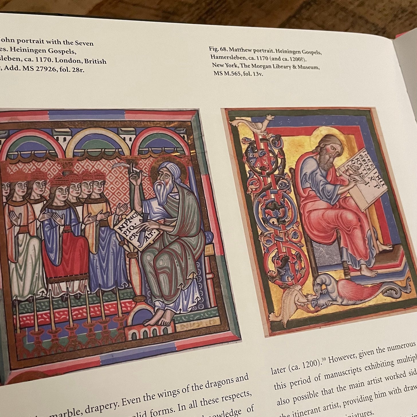
Originally, these books were produced by monastics. But in the twelfth century lay artists began to assist monks and nuns in the effort. Artists at the time did not sign their work, but scholars can tease out different hands by their style. Sometimes they can find the work of an itinerant lay artist side by side with a monastic artist in the same book, as with the twelfth-century Heiningen Gospels.
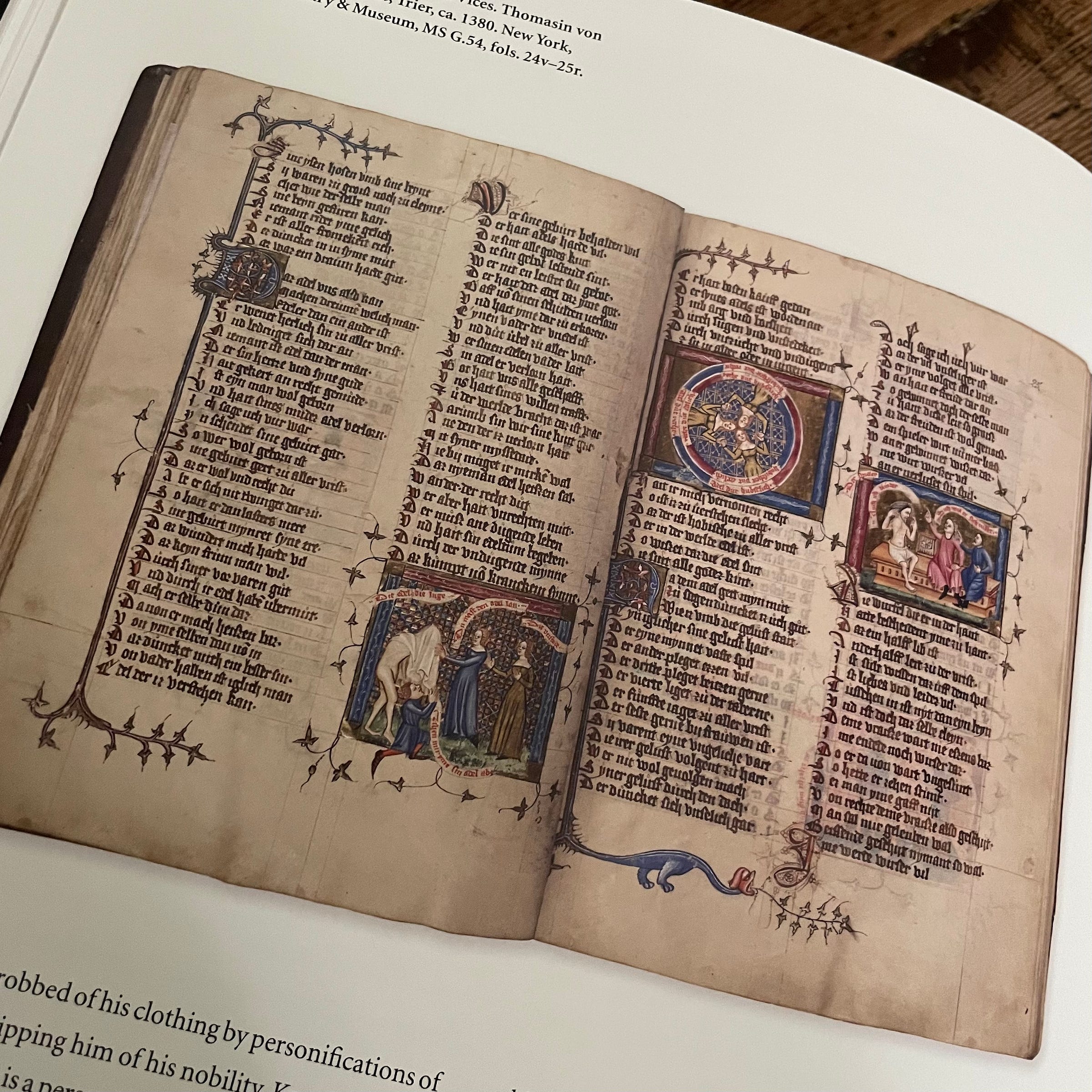
As urban culture expanded in the thirteenth century, book production gravitated toward cities, where aristocratic patronage made room for books with more secular concerns. Hamburger and O’Driscoll point to The Italian Guest, a didactic poem by Thomasin von Zerclaere, which sought “to educate noblemen in the rules and norms of courtly love (minne), chivalry, ethics, rulership, and what we would call good manners.” Think self-help for Italian lords. Naturally, it included illustrations to drive home its lessons.
Patronage is the operative word in the preceding paragraph. Because these books were so extravagantly made and decorated they required significant investment to pay for them, limiting the clientele to the wealthy and powerful. But as artists increasingly gathered in cities they began to build up markets for their work, enabled by wider political and economic forces.
Imperial cities in the Holy Roman Empire possessed the privilege to hold market fairs. “Tied to far-flung commercial networks, these fairs enabled cities such as Augsburg, Nuremberg, and Frankfurt to become hubs for skilled craftsmen, who in turn produced luxury goods of all kinds, among them books, both printed and handmade,” say Hamburger and O’Driscoll. “The development of these cities led to profound changes in patterns of artistic patronage, particularly when it came to making works for the open market.”
Frankfurt is famous for its book fair to this very day. The foundations of modern book culture in the West find their source in the book markets of the Holy Roman Empire as they shifted in the fifteenth and sixteenth centuries to paper and print.
Performing the Gospels in Byzantium

Modern habits of book use are well engrained and inhibitive, meaning the obviousness of our own habits make it tough to imagine people using books in other ways. But there are some interesting consequences to living in a world before paper, print, and pixels.
Given their pre-print production, the biggest differences between medieval and modern books aren’t parchment and hand-painted pigments. It’s more basic: Almost no one could read medieval books. I mean that in two ways. First, since each volume was individually produced by hand, there was only one copy of any particular book. Yes, there were often others like it. But not many; mass production depends on printing. So only a limited number of eyes ever fell upon any particular book.
Second, widespread literacy is a modern phenomenon. Literacy would have been more prevalent in a city like Paris or Constantinople but still limited. Mass literacy also depends on printing—especially industrial printing.
These two realities don’t matter when we think about the nobleman-in-training paging through his personalized copy of The Italian Guest. He knows how to read, or is learning. And the book is meant primarily for him alone. The same could be said for medieval books of hours—prayer books. Pictures might allow an illiterate family member to follow along, but the primary user could read.4
But what about a gospel book like the Lindisfarne Gospels, or one of the many lovely lectionaries produced in the heyday of the Holy Roman Empire? As mentioned above, these were liturgical books meant for use in public worship. The person who possessed the book was responsible to share its contents by reading aloud to a roomfull of listeners who would never set eyes on the pages themselves. The books were designed for this kind of use, providing spaces between words and punctuation for more accurate and fluid public reading.
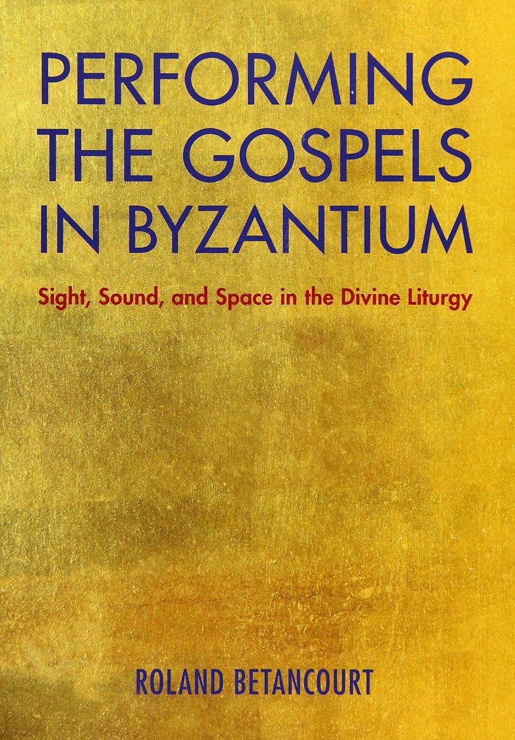
But then why go to all the trouble to cram the books full of gorgeous illustrations almost no one would see? That’s a question raised and answered by UC Irvine professor Roland Betancourt in his book, Performing the Gospels in Byzantium. Betancourt examines Gospel lectionaries and related volumes, along with the spaces in which they were read, to explain how these books were used in Constantinople.
In a world where holy texts were scarce, a person went to hear their local priest, deacon, or ordained reader read (usually chant) the Bible and other literature following a set annual schedule. Those listeners would try to imagine what the book described. “The listener must generate images in the mind to visualize the narratives, before they can be grasped,” writes Betancourt. But that means the performer must first visualize the scene and be able to anticipate upcoming elements of the narrative while they real aloud—while they perform the text.
Parishioners could look at the iconography on the walls of their local church for visual help, but the reader’s eyes were on the page. Many of the illuminations Betancourt focuses on are small images in the margins (“miniatures”) that depict characters and actions. Such images enabled the reader to capture the narrative—and even some of its deeper significances—as he conjured the scene in real time for the listeners.
We should see such marginalia as significantly shaping how that skilled reader performed the Gospel text in the liturgy, by presenting him with graphic images that enlivened the text as he was reading it, bringing the scenes described on the page into his mind so that he could adequately communicate their nuances through his intonations, stresses, and handling of the Gospel’s breaks and punctuation.
The interplay between iconography on church walls and manuscript illuminations schooled the imaginations of both the reader and his audience. Offering more than mere instruction, the combination of words and images could also inspire. Writing about the year 1000, Ioannes Sikeliotes described what it was like hearing the deceased bishop of Miletos, Nikephoros, read aloud:
If you heard him read (as those who had heard him attest), you would say that he was snatched away; with his soul suspended from the words, he journeyed toward heaven.
If the perhaps fanciful report of Prince Vladimir’s ambassadors to Constantinople is true, that would go for the audience as well. “We did not know,” they said after attending liturgy in Hagia Sophia, “if we were on heaven or earth.”
We tend to privilege what we know. But to fully appreciate the books we love we should extend our view to encompass the past—not only to find beauty and grace in human craft and creativity (artifacts such as these are worthy of at least that), but also to be challenged to imagine the experience of people who lived very different lives than our own. In some cases we share the same texts with them, and yet we presume their encounters with it were roughly the same as ours.
They weren’t, and they couldn’t be. And yet those encounters were nonetheless meaningful and both shaped and inspired their lives. It’s worth contemplating how.
Thanks for reading. If you enjoyed this post, please share it with a friend!
More remarkable reading is on its way. Don’t miss out. Subscribe. It’s free, and all the cool kids are doing it.
Rex Winsbury, The Roman Book (Duckworth, 2009).
Anthony Grafton and Megan Williams, Christianity and the Transformation of the Book (Belknap, 2006).
And women: the scriptorium at Chelles (near Paris) was, for instance, run by nuns.
Eamon Duffy, Marking the Hours (Yale University Press, 2006).


As I looked at the beautiful illustrations accompanying your brilliant essay, I was struck by how different the medieval sense of beauty and artistic expression is from that of our own age. The illustrations are complex and sophisticated, with swirls and weaves that follow defined patterns (the Fibonacci series?) and with elements that represent both nature and humanity. What an incredible difference to the simplistic artistic forms of our current era.
I was also struck by the fact that all the material in these amazing volumes was produced by a stylus of one form or another in a human hand. Through history, that was how all art and literature was created. I wonder if there is genetic code for humans to create with a pen or stylus in hand. How have keyboards and screens changed the style and content of what we are all producing?
The art of typography, the designing and setting of typefaces, really continued the work seen in the Lindisfarne Gospels, of making the message come alive through the text. I perceive individual letters as having personality and gender - a form of synesthesia called ordinal-linguistic personification. For me, the text of any book is 'alive'.
But a poor choice of font and spacing, like a font that is narrower than it is tall or inadequate spacing between paragraphs - faults found in many self-published books - can strangle the message. Even in online text, font and spacing will make a difference. The design of Garamond or Helvetica, etc. may seem more utilitarian than artistic, but in reality, it takes an artist's instinct to set a readable font.