Bookish Diversions: Seeing and Being Seen
Full-Capacity Magazines, Reading in Public, Designing Book Covers, Back of the Book, More
¶ Full-capacity magazines.
writes about his love for print magazines in a recent edition of . With the right mix of features, departments, and rotating regulars, a well designed magazine is an ideal format for short-form reading, especially essays and other nonfiction.
Harper’s, Humanities, First Things, Plough, and others all wing their way to Mattix’s doorstep at regular intervals, though he lingers a moment in describing the Catholic bimonthly journal, The Lamp. “A print publication should look and feel amazing,” he says.
The Lamp does. I’m off hooch right now for the refinement of my soul and my cycling legs, but The Lamp pairs perfectly with a couple of fingers of Bourbon, neat, and a smoke on the front porch in the evening before dinner. The paper is heavy enough and of the right texture to make each issue an object, not just a medium, and every issue is sprinkled with lovely reproductions of drawings and prints. . . . Reading print should be a complex aesthetic experience that uses multiple senses (touch, sight, smell) to compliment the words.
No slight on digital media—this is, after all, an email newsletter—but there’s something unique about print. Fear no empty nostalgia from me. The particular alchemy of text, image, layout, and material genuinely elevates reading a print magazine to the realm of special experience.
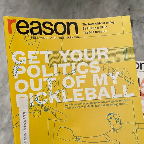
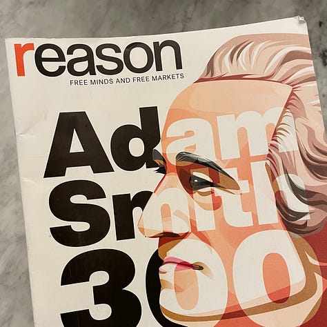
I currently subscribe to Reason, The Atlantic, Harvard Business Review, New York Review of Books, The Paris Review, Forma, and a few others. I subscribe to NYRB and The Paris Review precisely for their digital archives, but I do enjoy when the print editions—the first quite large, the second quite small—hit my mailbox.
Reason is a different beast. I’ve subscribed to Reason since before I subscribed. My dad, a Libertarian Party organizer from the early days, subscribed and had stacks with issues reaching back to the publication’s inception. I read them all in my teens and early twenties and scoured every new issue when it arrived.
UC Davis economist Thomas Hazlett used to write the final column, “Selected Skirmishes.” Aspiring to be as smart and funny as Hazlett, I always read him first. Charles Oliver now has the back page, reserved for his parade-of-outrage Brickbats column that once ran closer to the front of the magazine. It’s excellent, but I still read it second regardless of placement.
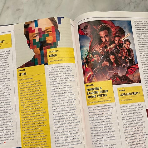
Nowadays I start with editor-in-chief Katherine Mangu-Ward’s opening piece before wading more or less at random into the issue and its tidy smorgasbord of articles. I say tidy because issue to issue the layout manages to be both surprisingly fresh and also reassuringly consistent and navigable.
If you were a fan of the old print edition of Wired, you’ll recall its wild and unpredictable pages. Remember all the arbitrarily numbered lists, the off-kilter columns? The unhinged aesthetic served the future-looking nature of the text. Reason manages a similar subliminal message with its layout. It feels free but seems to follow an unspoken emergent order—just like the world its writers attempt to describe.




¶ Visual stimulation. One of the benefits of print is that its products remain visible even when we’re not engaged with them. No screen blinks off into gray-black invisibility; the shape and color still present themselves to attract the eye. That’s delightfully true even for eyes to which the print doesn’t belong.
Whenever I spy people reading in public I try to see what they’re reading—very nonchalantly of course, an extra glance, a lingering eye. Can I tease out the title? What story can I tell myself about the person reading it? Hmm, Proust. Seriously, at the park?
And what if this sort of activity is really a subtle two-way communication? What does the person reading Proust at the park want others to think of them? What about when I’m reading in public? What do I hope people take from the issue of Reason I’m holding, or my Zora Neale Hurston? Also, how vain is that?
In a New Yorker humor column, Maeve Dunigan captures some of the hopeful self-regard book readers possess, imagining how others might see them if spied with a book on the bus or a park bench. Here’s a sampling:
“That girl could be on her phone but she chose to read a book instead. I bet she has never watched a full season of ‘House Hunters International’ in a single day.”
“That girl strikes me as someone who has moderate to advanced knitting skills, but isn’t weird about it.”
“That girl could explain the Electoral College to me in a way that isn’t patronizing at all.”
“That girl has the kind of calming presence that you would want around when taking the LSAT or birthing a child.“
When I was recently reading Kyle Smith’s Cult of the Dead: A Brief History of Christianity I bet no one thought about my possible knitting skills or my calming presence at a birth.
¶ How books get dressed in the morning. A barbarous iconoclast recently demonstrated on Twitter how he treats book covers. He (breathe!) strips them off and (breathe!) drops them into the (breathe!) trash. This minor atrocity has been viewed more than thirty-seven thousand times at this point.
While the video was shared in fun, it got me thinking about covers as visual statements. I can tell you from my days in publishing the cover design process is highly involved and concerns the designer(s), the publisher and editor, sales and marketing teams, sometimes even the author. I kid! But only slightly. The author’s buy-in on the cover usually comes last or nearly so; sales usually sees it after the author.
I still work with authors from time to time, and the cover process is in its way far more stressful than even the editorial process. There’s so much riding on the right cover, from its representation of the story or argument to its retail presence and how it looks on a shelf.
Authors are relatively powerless in the design process—though I’ve sure seen some try storming the Bastille. When I mention that reality to people outside the industry, they’re usually incredulous. If you’ve ever wondered how a book gets dressed in the morning, Carolina Ciucci has a helpful breakdown at Book Riot that details the process.
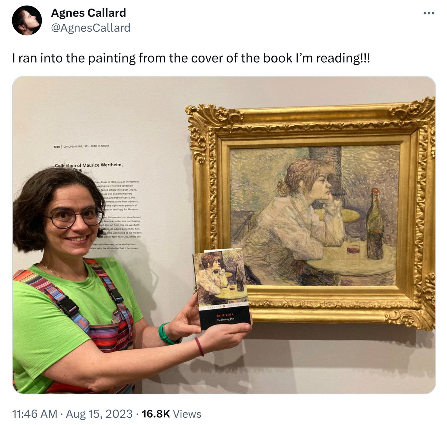
¶ Wait, I’ve seen that before! Philosopher Agnes Callard, while reading Emile Zola’s The Drinking Den, happened upon the painting used for the cover of her Penguin edition.
The painting is a detail from Henri de Toulouse-Lautrec’s painting The Drinker, currently housed at Harvard’s Fogg Museum. How did I find that out? I looked on the back of the same edition Callard was reading; the painting and its location is mentioned there.
Someone asked Callard if she found the art by random or whether she sought it out. “Random!” Callard answered. “I wince to think of all the times I must’ve been in a city containing the painting of book I was reading and didn’t go to the museum to visit it! Lesson: ALWAYS check back of the book!”
¶ Displaying books. I’ve written before about the amazing qualities of bookcases, qualities that depend on the visual nature of print and its display—which reminds me of this bit from UC Berkeley professor David Henkin:
Students entering my office sometimes inquire whether I’ve read all the thousands of books that line its walls. . . . But whether books represent our past experiences or our dreams for the future, the way we showcase and arrange them seems interesting in an age in which databases and search engines have eclipsed books as tools for looking things up. Displayed books gesture forward and backward to acts of reading and rereading; of purchasing, posing, moving, and unpacking; of passing time and dropping into its folds.
Sounds divine.
¶ Take more risks. It’s amazing the stuff that sticks with you. In one of his “Selected Skirmishes” columns in Reason, Thomas Hazlett recounted an exchange with the father of his high-school girlfriend. “I must say,” the man boasted, “that in my dating days, I never once asked a girl out who didn’t say ‘yes.’”
Hazlett figured the brag was calculated to make him feel insecure, but it didn’t really work. “Even as a callow youth,” said Hazlett, “I knew the answer to his hollow boast: He simply hadn’t asked out enough girls.”
I first read that back in 1996, and I still remember that point when thinking about failure and risk. If you haven’t failed much, you probably haven’t taken enough risks.
Thanks for reading! If you enjoyed this post, please hit the ❤️ below and share it with your friends.
Not a subscriber? Take a moment and sign up. It’s free for now, and I’ll send you my top-fifteen quotes about books and reading. Thanks again!


Absolutely love this piece. Sat on a beach in North Wales, it makes for perfect afternoon reading. The sheer joy of books and magazines. Thanks Joel!
Thanks for the shout-out, Joel! I have yet to see anyone reading "Cult of the Dead" in the wild. When and if I do, I'll be sure to ask them if they knit.