

During the mid-1990s I began to apprentice at Larkspur Press, a rural Kentucky-based letterpress operation run by Gray Zeitz. All the type at the press was set by hand and (for the most part) printed on a Chandler & Price clamshell press, retrofitted with an electric motor to replace the original foot treadle. Gray was a one man operation and had already been printing for over three decades at that point.
Gray’s specialty were fine press books and broadsides, usually poetry, of local Kentucky writers mostly. Among that number was Wendell Berry, who lived in the next county over. Gray had printed a number of limited editions of Berry’s works over the years.
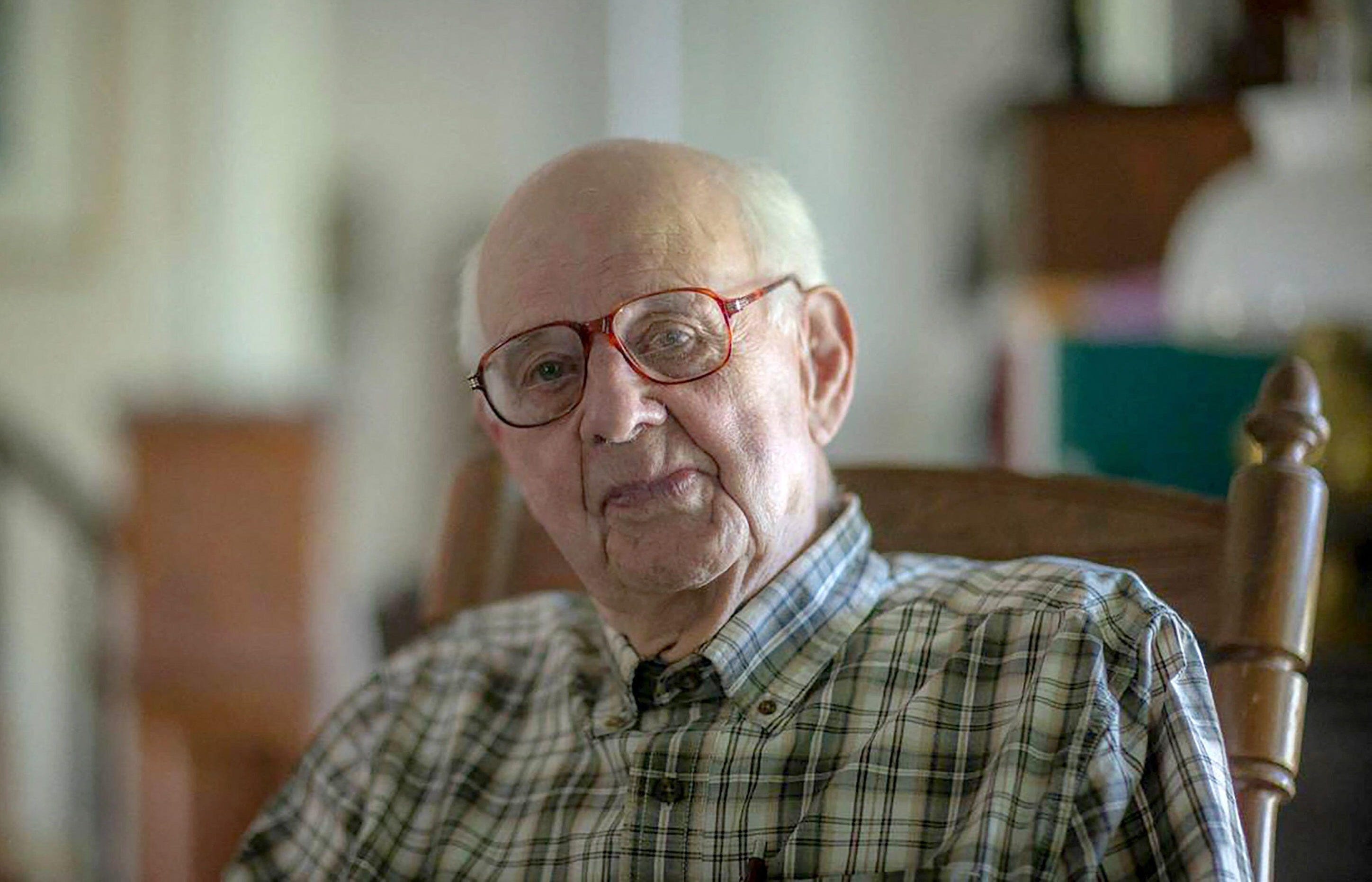
I was fresh from graduate school and had moved back to central Kentucky. Gray had agreed to take me on, and on spare days I would drive through Frankfort to the outskirts of Monterey where Gray lived and had his shop. Monterey had been a kind of arts destination spot in the 1970s, but most of that had fizzled out by then. Gray’s Larkspur Press was the real legacy of that movement, and Gray was (and is) certainly one of the best practicing letterpress printers in the U.S.
Gray himself had learned printing at the University of Kentucky’s M.I. King Library Press, which was a teaching letterpress in the basement of the U.K. library. It was a legacy of the Bur Press, founded by two librarians in the 1940s and also the influence of the Austrian artist, type designer, and printer Victor Hammer who ended up in Lexington after World War II (a fascinating story for another time). Gray used Hammer’s typefaces frequently, particularly his most well-known typeface American Uncial.
As an apprentice I started at the bottom with unglamorous—but needed and instructional—tasks, such as distributing type back into type drawers. I also folded a lot of pieces of paper (there’s a proper way to do it). Whatever needed doing, I did it, while I also certainly tried Gray’s patience with questions. After some months of this, along with also spending what time I could at the M.I. King Library Press, I decided to try some projects of my own under my own imprint, Adela Press. “Adela” was the name of the community where I had grown up in Eastern Kentucky. At one time Adela even had its own post office, now long extinct.
My first two letterpress projects were broadsides, single sheets with printing only on one side, of poems by Kentucky poets Jane Gentry (a former teacher and neighbor of mine) and James Still. My desire then was to print something longer as a chapbook.
With proof of concept in hand, I asked Wendell if he might have a poem he would let me print. In March of 1996 Wendell sent me a poem titled “Amish Economy,” which was something new he had been working on. It was exactly the sort of thing I had hoped for. It was long enough for a chapbook, but not too terribly long for a relatively inexperienced printer like me.
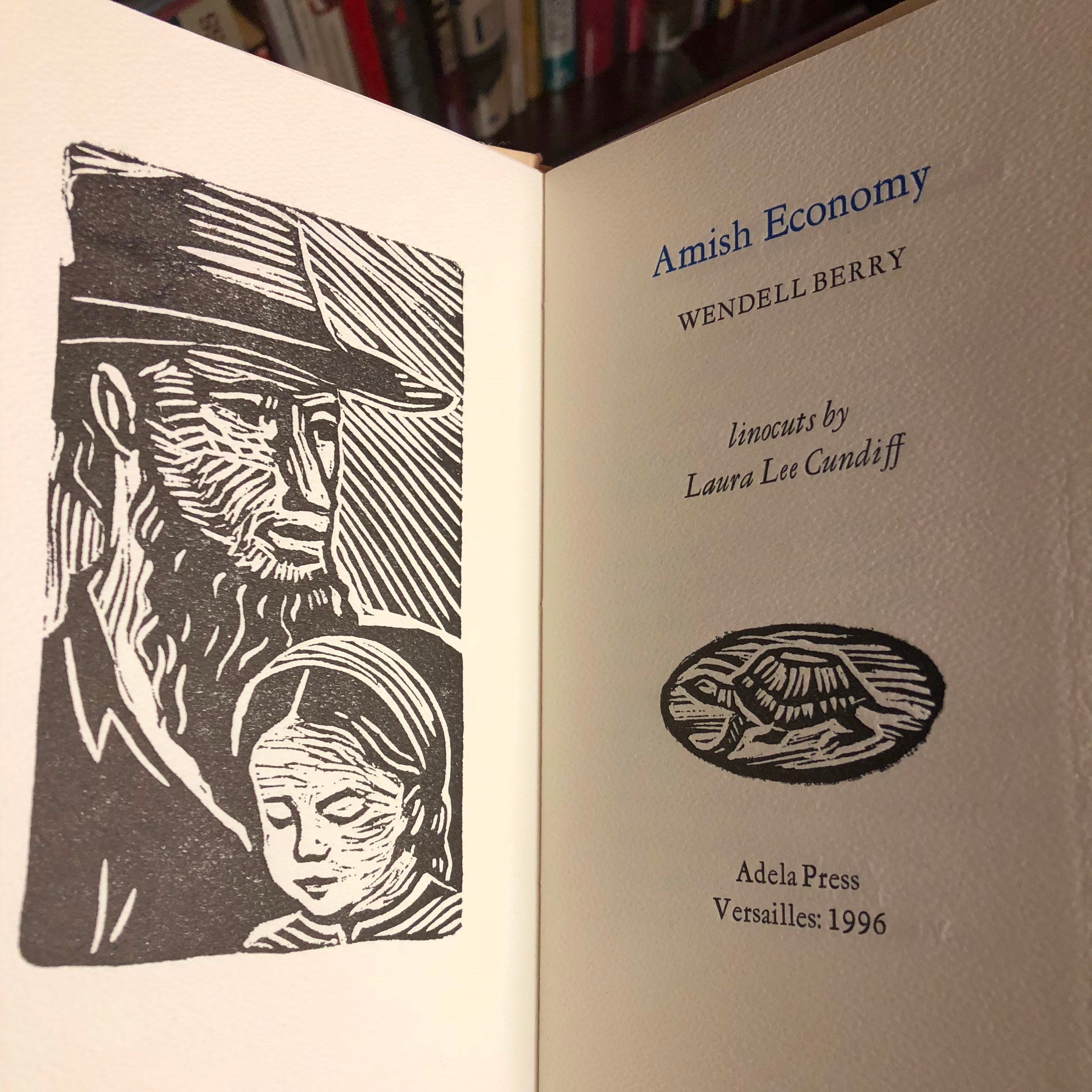
I commissioned another then-neighbor artist, Laura Lee Cundiff, to illustrate the chapbook. Laura Lee had previously provided the illustration for the Jane Gentry broadside. With both she had created the illustrations as linoleum engravings. At the advice of Gray Zeitz those illustrations were sent off to a company that would make metal plates and set them at type height. Gray’s experience was that a linocut simply wouldn’t hold up to repeated printing with a mechanized press like a Chandler & Price. I had done the same with the illustration for my initial Jane Gentry broadside.
I decided to issue the chapbook in three different formats, the primary difference between them being the paper. Most of the papers I used were from a German company called Hahnemuhle. For the primary edition of 400 I used machine-made papers: Natur Text for the text and a heavier Gainsborough paper for the wraps. Although high-grade papers, they were less expensive and could be printed dry.
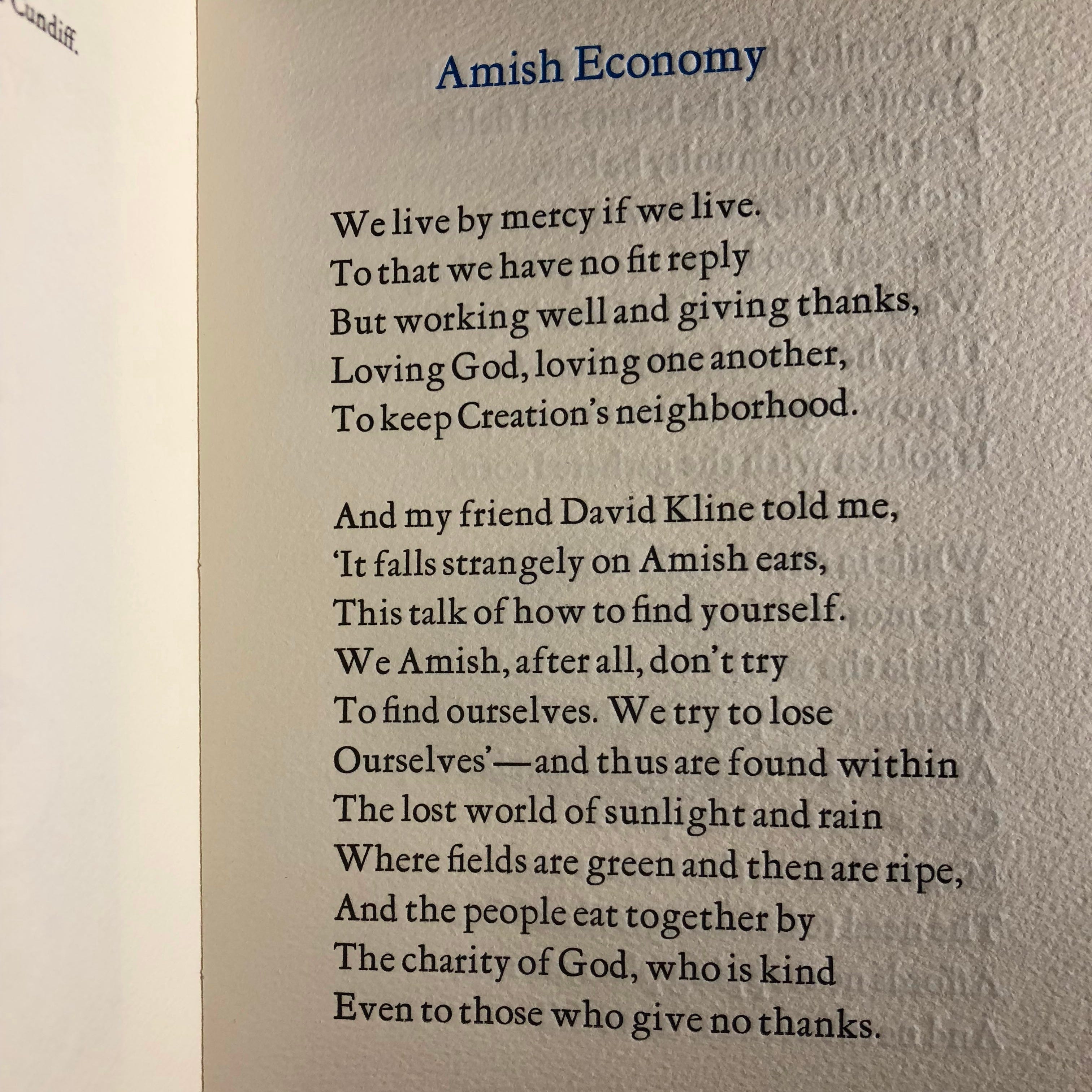
For the two deluxe editions I settled on a paper called Biblio for the text, which has a wonderful soft texture. Gutenberg was used for the wraps, which has this incredible wavy pattern with small inclusions. I had fallen in love with it from the samples. Both of these are “mould made” papers, which, while machine-made, emulates actual handmade paper. They can be exceptionally nice and come with lovely deckled edges. These papers were more expensive, and I printed both dampened.
Dampening paper is an old process used with high quality printing that allows the letterpress to bite into the paper more easily as the dampness lessens the resistance of the paper. The sheets have to be stacked with dampened felt sheets then allowed to set overnight wrapped up (in this case inside a plastic bag). The printing is also slower going as the paper needs to be removed from its humid environment one sheet at a time. Each sheet of paper ideally will be dampened the same, and you don’t want them drying out to different degrees before printing.
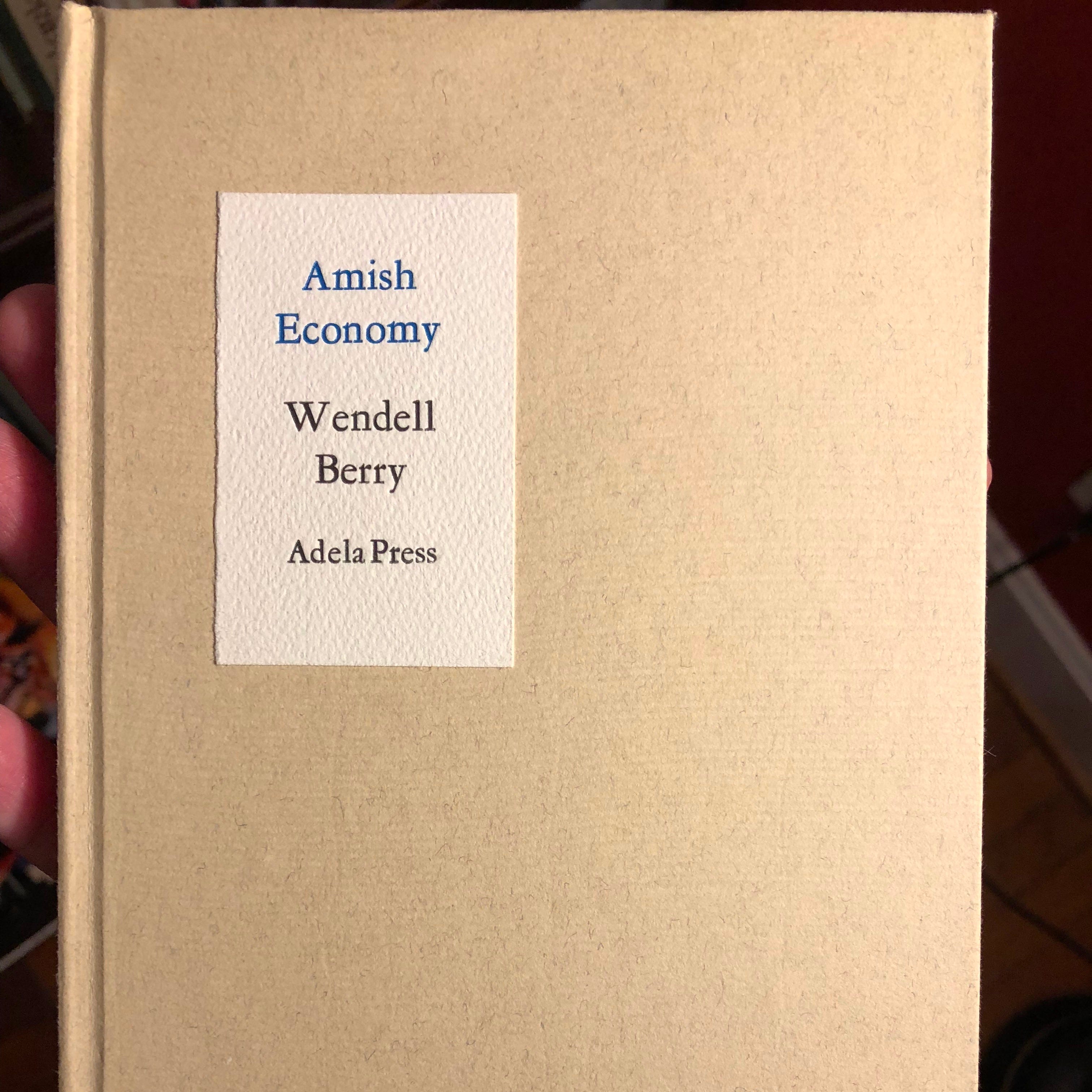
The entire run of 526 (plus a few extra) was each folded by hand and then hand-sewn, each step done by me. As you might imagine, this took quite some time over many evenings. The twenty-six lettered copies, labeled A–Z, were bound as hardcovers. All of that binding work was also done by me. Each case was glued one at a time and finished in wooden bookbinding presses I had. Only a few could be pressed at any one time, so this of necessity also took quite some time. Honestly, looking back I’m amazed that I did all of that alone.
The deluxe Biblio paper copies were also signed by both the poet, Wendell Berry, and the artist, Laura Lee Cundiff. The signatures were done on the final colophon page prior to binding. The colophon is a page that often is included in fine-press editions to describe particularly of the book such as edition size, paper used, and typefaces employed. And finally, I included an extra copy of the frontispiece illustration with the hardcover A–Z editions.
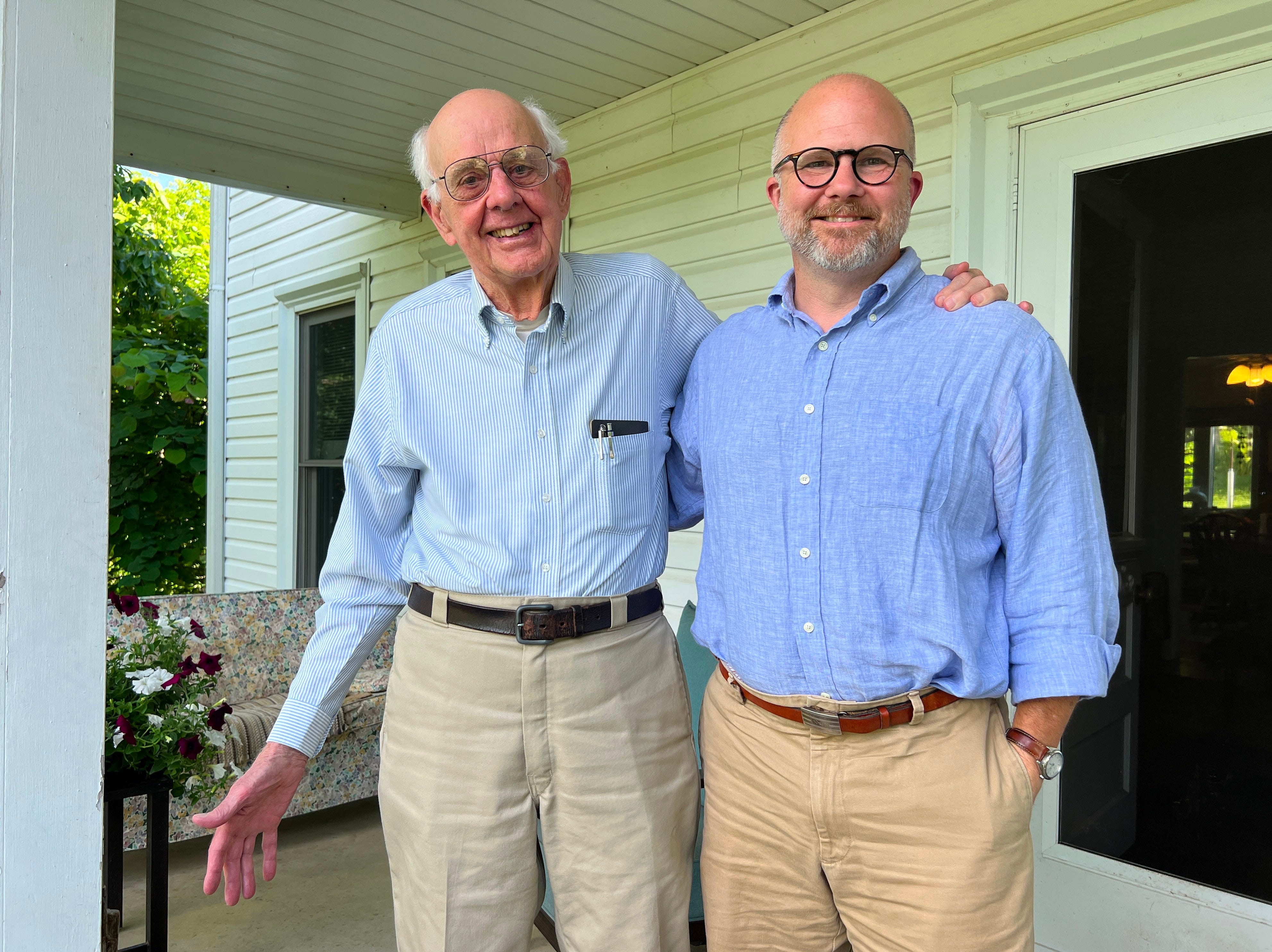
Predictably, copies sold quickly, as Wendell Berry was always in high demand, especially with a limited edition. Of course, at the time I intended this to be the beginning of many future printing projects. Life gets in the way, and after one more broadside project Adela Press closed up shop.
It’s nice to look back on this project in this thirtieth anniversary of its publication. I am proud of having published Amish Economy, but with the passing of my old friend Wendell, the memory is bittersweet.
If you found this post interesting or helpful, please restack 🔄, hit the ❤️ below, discuss, and share.
And consider subscribing: Free subscribers get two-week access to all new posts. Paid subscribers get the run of the complete archive, plus exclusive bonus content.
While you’re here, check out my earlier conversation with Alan Cornett 👇


Wow- I loved this so much. Listening to each step and the care taken with each part of the process of making the book was lovely. The beauty of something like this is that you imbue the act and energy of your creative process into each completed book. A hand-made or slow-made book carries an energy and life that a mass produced book never will.
This is beautiful. I have a few older books, mostly clothbound Oxford University Press books from the 1950s/60s, where the print is slightly pressed into the page, similar to the description and pictures here. It is so interesting to know that it is necessary to dampen the paper to get that kind of imprint.